The Church Project Continues

A few months ago I started photographing St. Bridget's Church.  Photographing the church, the stained glass windows, the altars and some of the more significant statuary has turned into a larger project than expected.

After the first visit I decided to compile a set of the images into a book to make them easier to share with friends and family.  That changed the nature of the project, increasing the number of images needed for illustration.

After three visits it looks like I'm "almost" half finished with the photography.  There are many stained glass windows and other items that are yet to be photographed.  Some photos will need to be reshot at better angles or different lighting conditions.  A number of the photos can't be taken until later in the year when the light comes from a better direction.

I've put a few sample images here.  My intention is to finish with the photography before the end of the year.

GS

St. Bridget's Church from the Choir Loft

Over the weekend I started experimenting with Nik's new HDR Efex Pro 2.  It looks like it is much easier to achieve more realistic results and get closer to a finished image before returning to Lightroom.

This is another test image from my St. Bridget's Church project.  Click here to see a higher resolution version of this image.

gs 

Top 5 Lessons Learned from the "Print-a-Day for 30 Days" Project

In February I redesigned most of my workflow around Lightroom 4.  The only thing remaining was to become much more familiar with the Lightroom’s print module.   Coincidentally, Mike Johnston of “The Online Photographer” blog recommended making one print every day for 90 days to improve your printing skills.   I decided to follow a shortened version of his plan with the goal of getting more familiar with Lightroom 4 and, maybe, improving my printing skills in the process.

For the last 30 days I've made a new print every day and posted the result.  I've learned (or have been reminded of) a lot along the way, but here are the five things that stand out.

1 – The 2012 process engine in Lightroom 4 is much better at pulling detail from raw files.  It also seems there are subtle improvements in color rendition.  I reprinted several older photos that had been processed with the 2003 and 2010 versions of the process engine.  Every one of them was improved just by rendering with the 2012 version.  This alone would be a reason to upgrade to the most recent version of Lightroom.

2 – No matter how well your monitor and printer are profiled and calibrated, you will still need to make test prints.  Many prints may be fine on the first try, however, the fundamental differences between front-lit prints and back-lit screens will mean, sometimes, the only way to achieve your desired results will require a test print or two.

3 – The printer inks are capable of printing a wider range of blues and greens than the monitor can display.  Be careful when boosting blue skies. What looks good on the screen may end up as an electric blue sky.  This is most likely due to the differences in color spaces used by the monitor (sRGB) and printer (Adobe1998.) That topic is way too deep for this list. I finally figured out that using the soft-proofing gamut warning helped avoid the problem.
  
4 – I added a vignette to some of the photos.  The characteristics of the vignette were a bit different on paper.  It seemed a bit darker and less subtle than on the screen.  I have a feeling this varies a bit with paper types.  Only one paper was used during the 30 day project so this is something left for future experimenting.

5 – The Printer wants to be regularly used.  I had been setting aside images and printing in batches.  Starting the printer after it hadn't been used for a few weeks usually required one or two cleaning cycles to get things smoothly flowing again.  There is nothing magic about a cleaning cycle.  The printer flushes the lines and nozzles with ink, the most expensive liquid on the planet.  

In 30 days of printing one print per day I didn't experience a single cleaning cycle.  The printer used much less ink than I expected.  Most of the ink tanks were close to full at the start.  All but two are still, at least, half-full.  Over the length of the project, only the grey, green and red ink tanks were replaced.  From now on I’ll print, at minimum, a nozzle check sheet every day.  Over the long haul, I suspect I’ll use much less ink.

At project’s end, I feel like I’m familiar enough with Lightroom’s printing module to say it’s now my preferred way to make prints.
  
gs
Garden Structure - Print-a-Day-30

This is number 30 in the series "Print-a-Day for 30 Days."

This is a roof detail from a structure at the local botanical gardens.

This photo is loaded with detail.  The end and side grain pattern in the wood, even the highlights are full of small detail.  There are no broad swaths of pure color in the photo.

It was not terribly difficult to print the photo.  The most difficult part was deciding when to stop tweaking Lightroom's highlight and shadow controls.  There's actually a lot of latitude in this image and it could be rendered several different ways.  In the end, you just have to stop playing and print something.

This is where I decided to stop, both for this print and the 30 day project.  It has been a good learning experience.  I'll post a wrap-up tomorrow.

gs

Farmer's Market - Print-a-Day-26 thru 29

These are numbers 26-29 in the series "Print-a-Day for 30 Days."

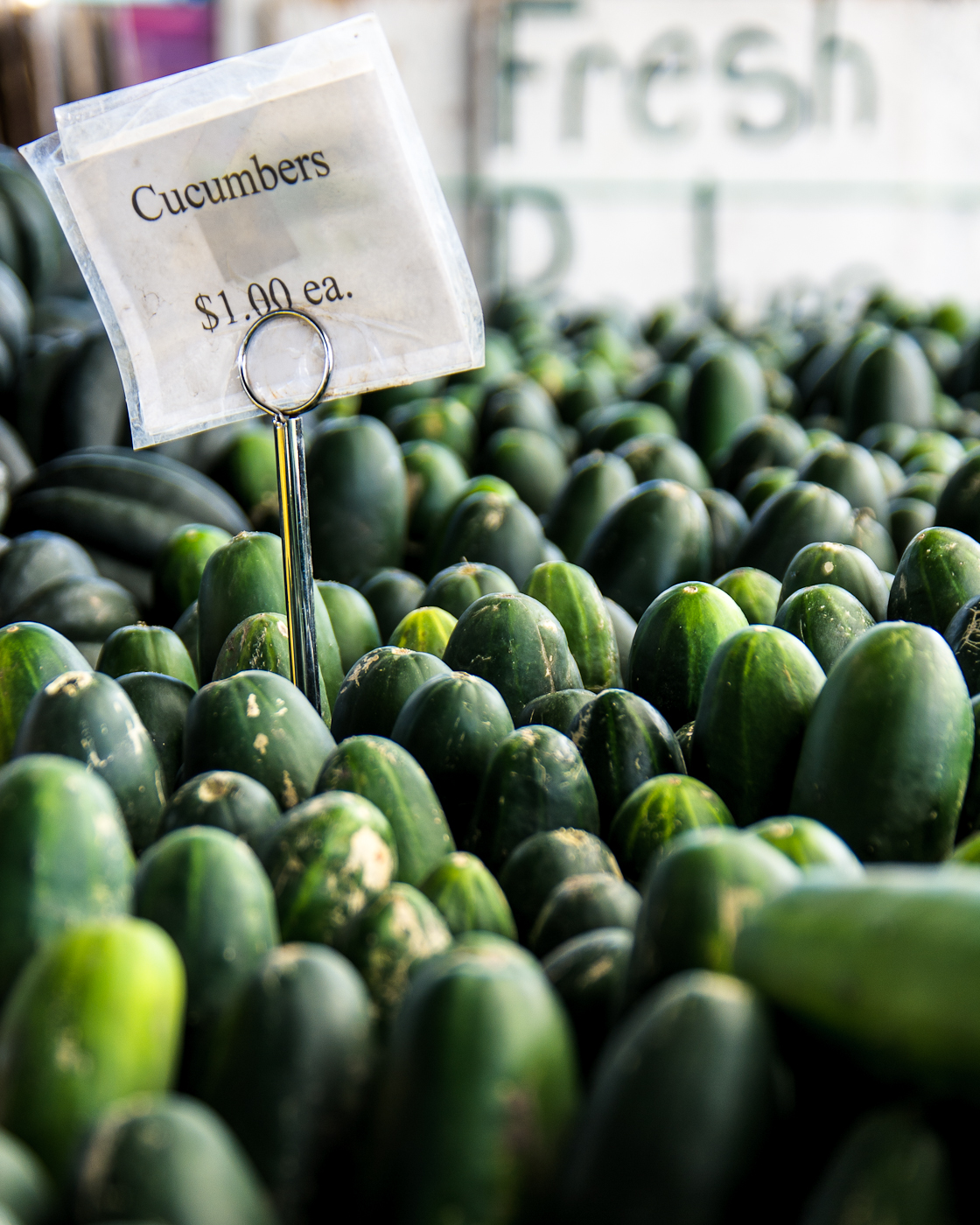
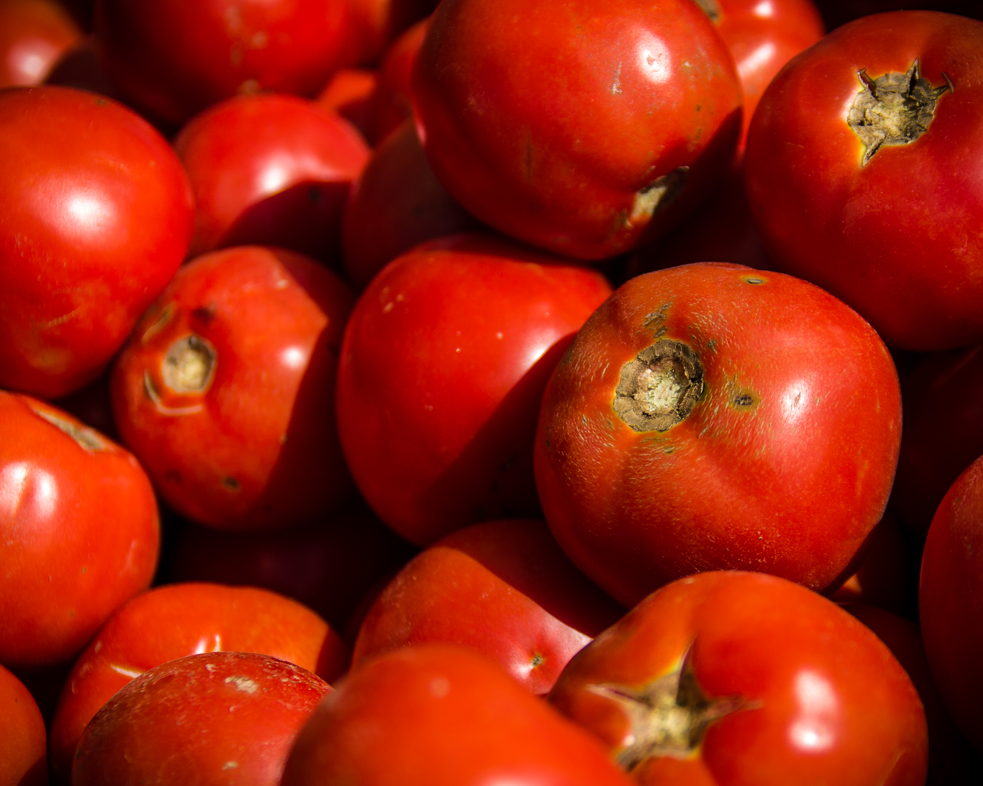
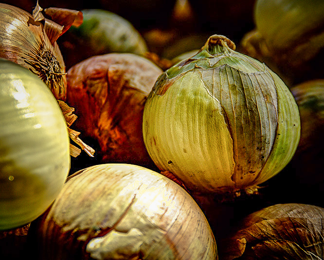
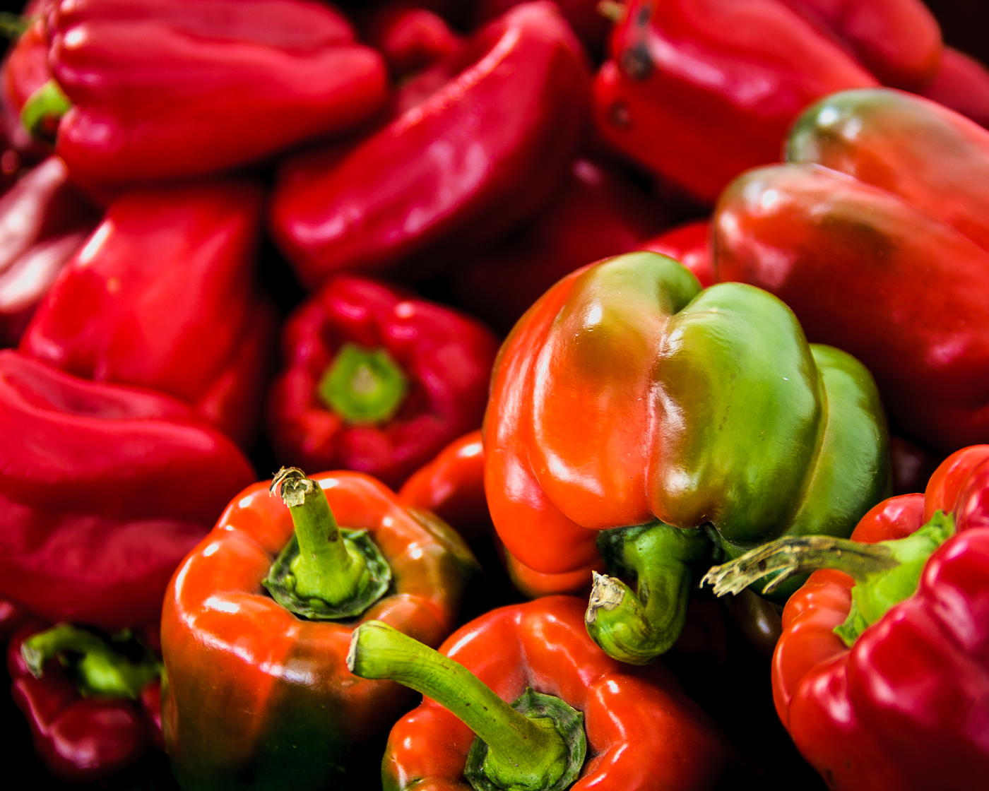
These four photos were taken in 2008 at a local produce stand.  The play of the light and shadow on the colorful fruits and vegetables was interesting.  This set of four was printed on consecutive days, but I thought I would group them for this post.  After the project is complete I'll likely hang this set in my kitchen.

This late in the project, there wasn't anything particularly new or different that came up during the printing process.  It was interesting, that after printing the tomatoes and peppers, the red ink level had dropped by about a third of a tank.

gs

Falling Leaves - Print-a-Day-25

This is number 25 in the series "Print-a-Day for 30 Days."

Yesterday was the hottest day of the summer and we are months away from falling leaves.  I've always liked this photo because of the tree with colorful leaves and the bright blue sky showing through its bare neighbor.

The 2012 version of the Lightroom 4 process engine pulled significantly more detail and color contrast from this image than the older version that was used when I shot the photo in 2008.  If you haven't revisited some of your favorite older photos with the new version of the software, you owe it to yourself to give it a try.

 I decreased the intensity of blue sky for the print version of this photo.  One of the lessons learned from this 30 project is the screen is not capable of displaying all the blue tones that the printer is capable of printing.  Boosting the sky to look great on the screen can lead to electric blue, unnatural skies in the print.

gs  

November Sunrise - Print-a-Day-24

This is number 24 in the series "Print-a-Day for 30 Days."

On my way to work I would often see a great sunrise.  This is one of the best.  I pulled off the highway so I could take this photo.

It makes a nice print.  I may frame this one.

gs

The Photographer - Print-a-Day-23

This is number 23 in the series "Print-a-Day for 30 Days."

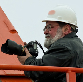
You might have to be a photographer to appreciate this photo.  For most people, I'm sure the idea of setting up a tripod to take a picture of an alley may seem a bit odd.  The juxtaposition of extreme care and dumpy subject makes me smile.

The photo didn't require anything special for print.  It was an exercise in using a couple of the newer tools in Photoshop 6.    The original photo was a quick snapshot taken with a very wide angle lens that happened to be on the camera at the time.  The perspective was a mess, and there was a lot of distortion that was corrected with the new wide angle tool.  If you examine the brick pattern on the lower right, you'll see a small mis-match left over from the removal of a tree by one of the content-aware tools.

It was fun experimenting with this one and it was a good learning experience.

gs

Burlington Window - Print-a-Day-22

This is number 22 in the series "Print-a-Day for 30 Days."

I have several photos of the Burlington building, but this detail may be my favorite.  This photo doesn't reach out and grab your attention, but you can get lost in the detail.  The "black and white in color" aspect seems to lend depth to the simple subject.

Printing this photo is all about maintaining the detail in both the shadows and highlights.  It is important to make sure the printer or process doesn't introduce an inaccurate color cast.  There is no natural color in the photo to mask the inaccuracy.

gs  

Public Sculpture - Print-a-Day-21

This is number 21 in the series "Print-a-Day for 30 Days."

This is a sculpture located in downtown Omaha.  I wonder if the artist considers the graffiti as a defacement or if it was expected as part of a public living art project?

I selected this photo for the printing project because of the two strong colors and the gradient in the sky.  By the way, even though the photo was taken in bright sunlight, fill flash was needed to light the graffiti.

gs

Burlington Building Reflection - Print-a-Day-20

This is number 20 in the series "Print-a-Day for 30 Days."

An exterior shot of the Burlington Building.  You saw an interior detail in Print-a-Day-3.   This is a beautiful old building with a lot of interesting detail inside and out.

Earlier photos in this series taught me that vivid blue skies can get even more vivid in the print.  As a result, I decreased the sky saturation and changed the hue slightly.  This version is unmodified.

gs

All Natural - Print-a-Day-19

This is number 19 in the series "Print-a-Day for 30 Days."

I took this photo in 2009.  The contrast between sun and deep shadow was what originally drew my eye.  Lightroom 4's new process engine brings much more detail out of the shadow areas and this actually made a very nice print.

I'll warn you now, if your monitor is not properly adjusted you're not going to see the detail in the photo.  If it's too bright (probably) the highlights will be washed out.  If it's too dim (unlikely) you won't see the rich detail in the shadow areas.

gs

Sand and Sneakers - Print-a-Day-18

This is number 18 in the series "Print-a-Day for 30 Days."

The annual Sand in the City competition was just a few weeks ago.  Teams of volunteers from local businesses compete to build the best sand sculpture in an effort to raise funds for a local charity.

A couple of tons of sand are dumped into a big pile to give the kids a place to play.  The sand pile is surrounded by little pairs of shoes.

This print was selected for the print project because of the detail in the shadows and the blue shoe laces.  The printer can produce a wider range of blues than can be seen on the screen.  I was curious to see how the laces would reproduce on paper.

gs

Transmission Gear - Print-a-Day-17

 This is number 17 in the series "Print-a-Day for 30 Days."

This is not one of my favorite photos.  I selected it for the printing project for two reasons.  There is a lot of detail in the deeper shadows and there are a couple of unnaturally bright colors.  I was curious to see how that would translate on paper.

After a quite a bit of experimenting in Lightroom, the best I can say is the final print is not horrible.  If I liked the content of the photo, I would be OK with the print.  As it stands, it was a good exercise for the printing project.

gs

Anniversary - Print-a-Day-16

This is number 16 in the series "Print-a-Day for 30 Days."

This is my cousin and her husband on their 24th wedding anniversary.  They're watching a video of their family history that was put together, as a surprise,  by their daughters.

This is, technically, a pretty bad photo.  We were sitting in a slightly darkened room, there is a big bright spot on the window shades, the ISO went way too high and the original photo is full of noise.  It's even slightly out of focus.  I was close to tossing it.

I'd rather the photo was technically better, but the expressions are just too good.  This image captures the feeling of that moment and will always be one of my favorites.

Lightroom helped save the photo.  The highlights were subdued and the shadows were increased.  Noise reduction was applied with a pretty heavy hand.  That smooths the skin a little more than I'd like. (I'm sure my cousin won't complain.)  A vignette helps to darken the window light.  Her hair and glasses were made a bit sharper with the adjustment brush.

And what do you know, when you look at the final 8x10 print from a normal viewing distance, it turns out to be a pretty good photo.  Not great, but it'll do.

gs

The Brandeis Building - Print-a-Day-15

This is number 15 in the series "Print-a-Day for 30 Days."

The Brandeis Building was built in downtown Omaha in1906.  It was the home of a large department store chain  for several decades.  It was added to the National Register of Historic Places in early eighties.  The exterior has been restored and the interior has been converted to condos, office and retail space.

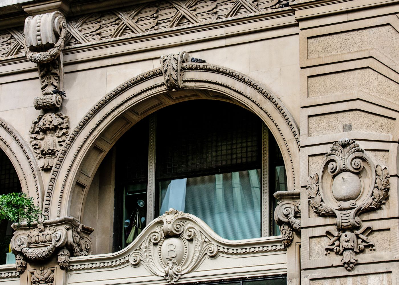
I selected this detail shot for the printing project because of the shadow over the window, the details in the window blinds and stone work, and the reflections of the much newer building in the window.

This photo certainly is no work of art, but it does record a different form of art that we don't see in modern buildings.

gs

Downtown Buildings - Print-a-Day-14

This is number 14 in the series "Print-a-Day for 30 Days."

It's been posted before. It was even used as wallpaper on my laptop for a while. I selected this photo for the project just because I like it.  No technical reasons. I just like the way it looks and I wanted a print of it.

There was no particular difficulty in printing.  I didn't do anything special.  I like the photo and I like the way it printed.

gs

Street Musician - Print-a-Day-13


This is number 13 in the series "Print-a-Day for 30 Days."

There are quite a few musicians that perform at the open air farmer's markets.    This photo of a young violinist is one of my favorites.

I decided to include it in the print-a-day project because of the big areas of blue sky.  In the past, with other printers, I've had trouble with this type of gradient.  There can also be an issue with blue and cyan.  The representation of this part of the color space can differ between monitor and paper.

I added the vignette to help define the border.  I had not felt that was necessary until I saw the printed version.  Now that I've seen it, I prefer the version with the vignette.

gs

Stalking the Swans - Print-a-Day-12

This is number 12 in the  series "Print a Day for 30 Days."

Nothing special here.  It's just a shot of one of the other photographers from a past photo walk.

I selected this image for the printing project because of the shadows on the stone wall.  The detail in the stone face depends on capturing the range of highlights and shadows.  It doesn't need to be perfect, but the variations need to be smooth.  If the shadows block up or the highlights are overblown, all the detail is lost.  I've been using glossy paper for this project and the print turned out just fine. 

Anyone think this might make a good puzzle?  There are services that turn photos into puzzles.  I haven't put a puzzle together for years, but that's what I thought of when I saw the wall.

gs